
Photo 1: San Francisco
Photo 2: Paris
See other photos here at PetaPixel


 I just ran across these beautifully hand drawn maps via Notcot and I'm in love. I am incredible jealous of those that can sketch such wonderful things from their travels. Well, hand drawn maps I think are even more fantastic! I just drool over this stuff. A La Carte offers maps from Barcelona, London, Munich, New York, Paris, Shangha, Tokyo, Vienna, Washington, D.C. and Zurich. These maps are a combination of "guidebook, tourist map and a piece of art all in one." It's kind of like a friend of yours that lives in that particular place hands you a map with all the hot spots, interesting tips, things off the beaten track and what to do and see. Perfect for those spontaneous adventurous Flashpackers and journal keepers alike looking for the best kept secrets. What a great way to make a memory. Shoot, time to place an order.
 Went to a Women's Fair Expo this weekend to scope out any travel agency competition and as I walked down about the sixth row of booths my eye was caught by this little one promoting plastic surgery. After I had walked past I realized "oh wait I made that booth! Like months and months and months ago but I made that!" So I had to back track and take a picture. Best little set up there I'd say. ;-) No really.

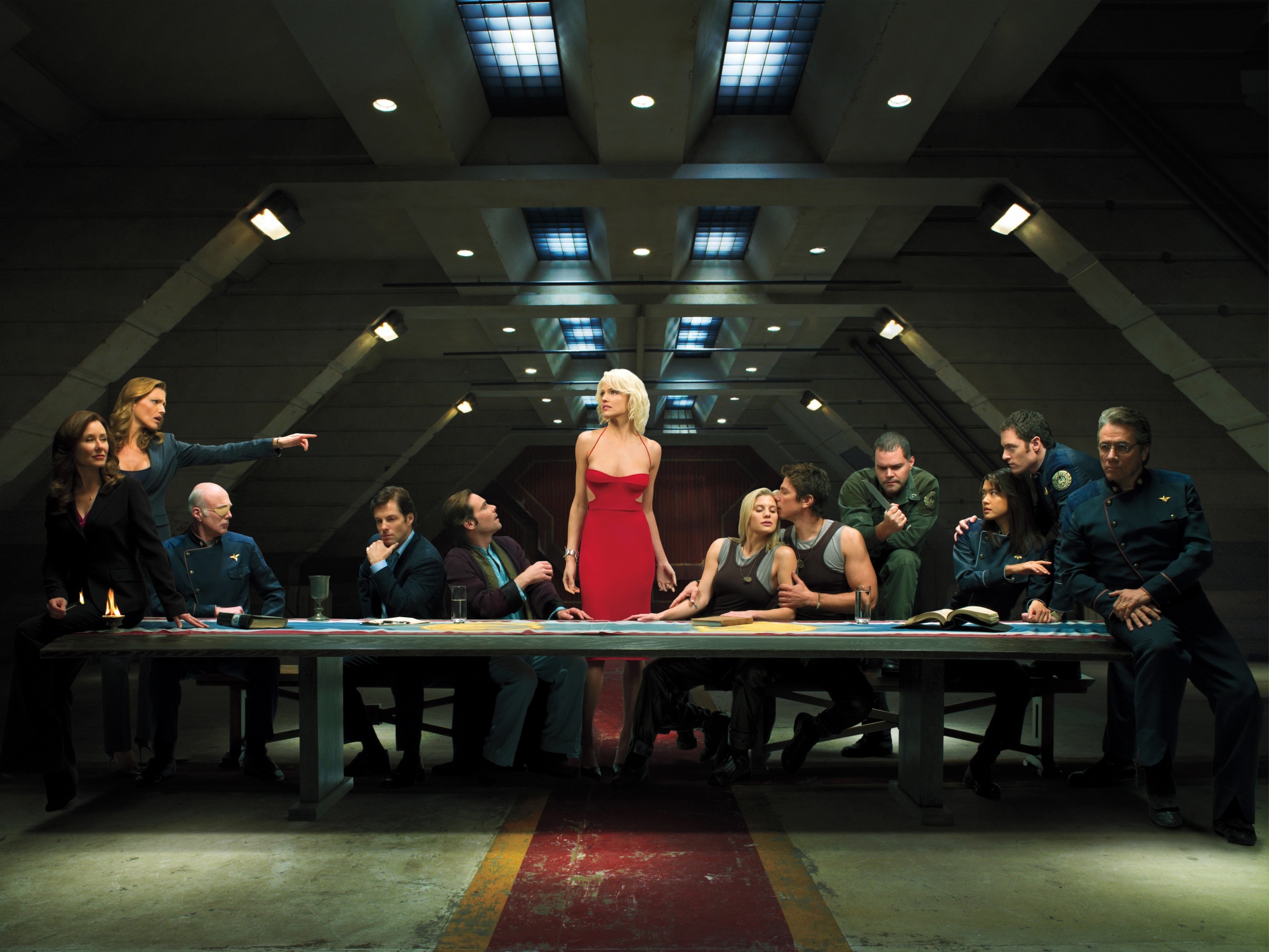
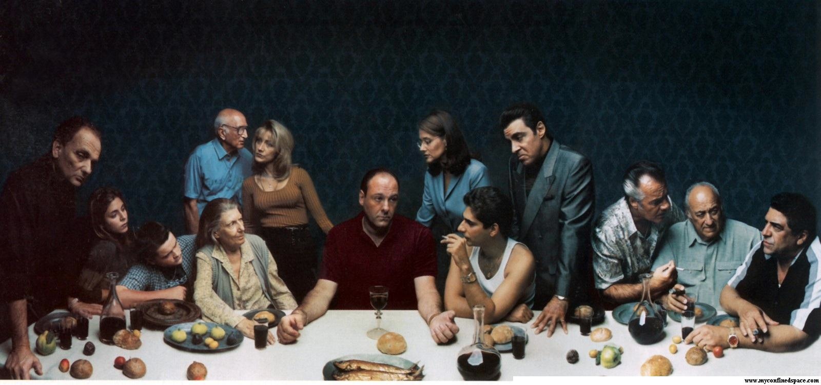
 How many of you Lost fans have seen this promo shoot - The Last Supper? Some say it may not have any meaning or hints to it, but I think thats wrong. Lost is known for throwing little bits of suggestions all over their shows, web, promos and print. And Locke as Jesus? Not far fetched at all, he died and rose form the dead. Check out some other Last Supper promos like House, Battlestar Galactica and The Sopranos.
 Art In My Coffee


Graphic Designer Tyler Thompson decided that Delta's boarding passes "make you want to scratch your eyes out" and its so true (along with every other airline). Not only are boarding passes just plain ugly, they are also ridiculous to try and read and find information in a hurry. Every time, I have to sit there and study these suckers for a few long seconds to see "shoot, what gate am I at?" or "I need to fill out these immigration forms like whoa and they want my what, flight number?" That requires some research. The color options probably wouldn't be doable on the airport's 70's style printers but these two above I love. They have the flight, gate, seat and zone right there for ya. I think he should totally take these to the airlines.
And thats what graphic designers are meant to do - change lifestyles and lives for the better. Why didn't I think of this?


 To get a little cash flow while I was living in México, I did some freelance work for an organization called Families Together. They were going to have a walk-a-thon to benefit children with disabilities and I got to design their poster. Last month they had a benefit dinner but I wasn't able to attend (because I was out on my honeymoon) but my business manager (aka my mom) did. Here she is accepting an award they offered me. It is so much more fulfilling designing when you know it helps others.
 Got myself an interview and designs printed in Dynamic Graphics Magazine. Talks about some of my goofy shenanigans. And above is a sample of a Cessna billboard I did for Wichita. Scroll to the bottom of the web page to read all about it!
 I ran across this thumbnail sheet of logos representing many different countries all around the world. It was kinda entertaining to see how each country was interpreted into the logo. So if I were to pick 2 countries to visit judging completely by the logo and nothing else it would probably be Australia and Chile. Portugal and Sri Lanka would have to be more on my least fav list. But points for trying.